Artefact
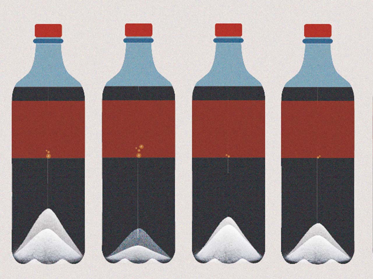
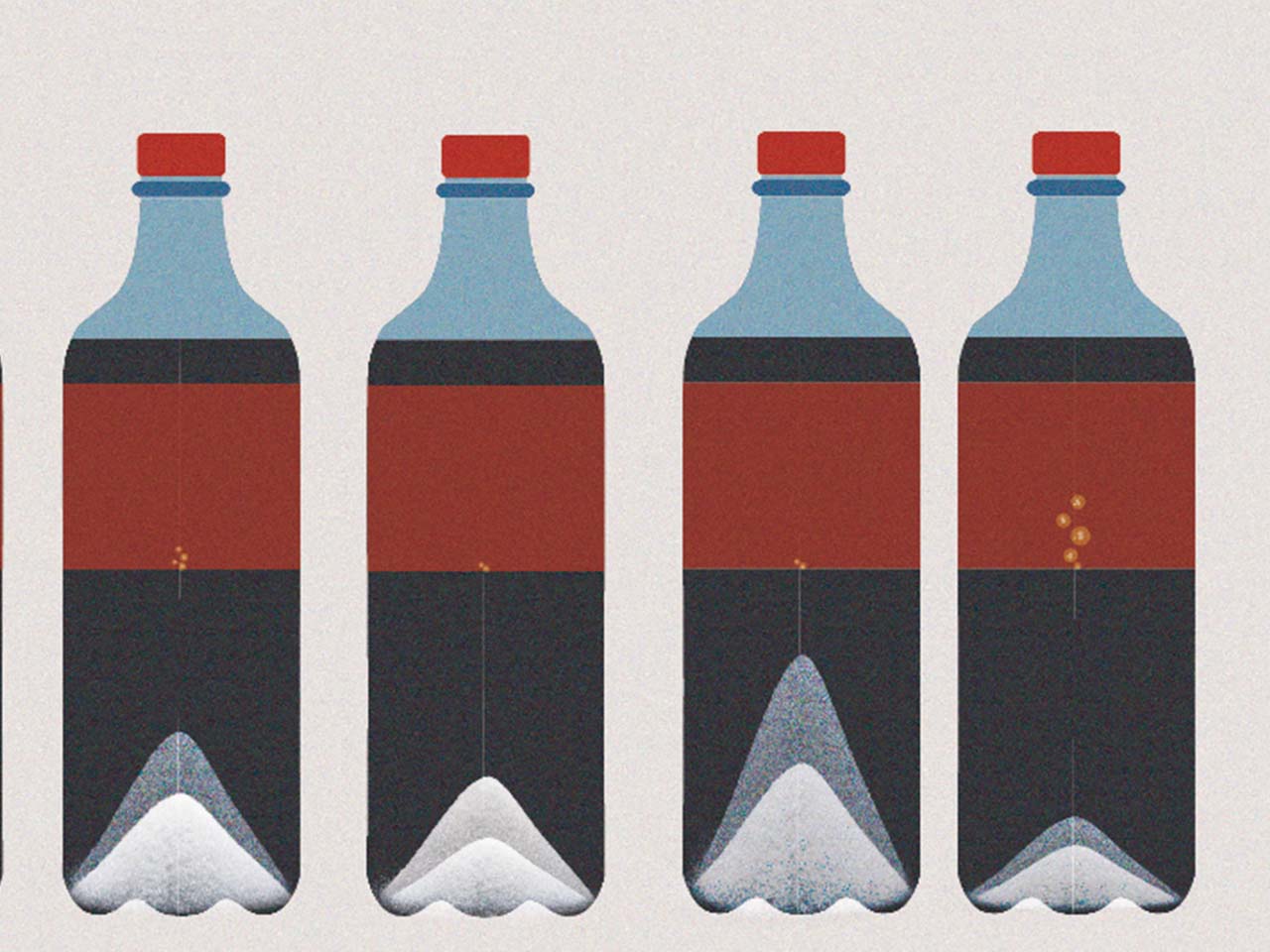
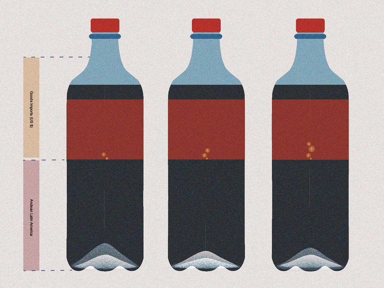
I decided to go withdrawing the data out since it is a more free and organic way of visualizing. My ideation process mainly explores how we could represent the set of data in a simple and clear way. .
Description
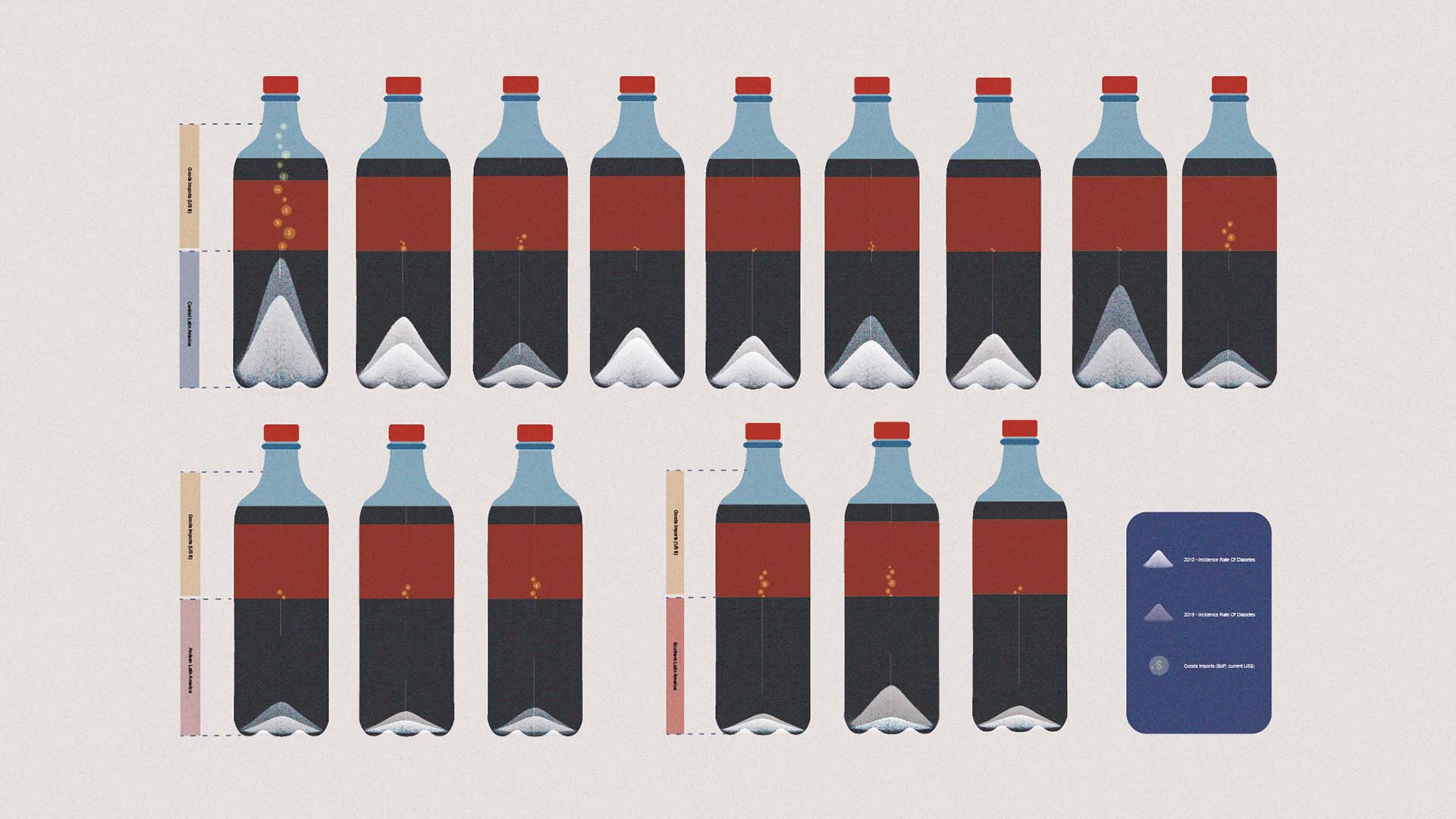
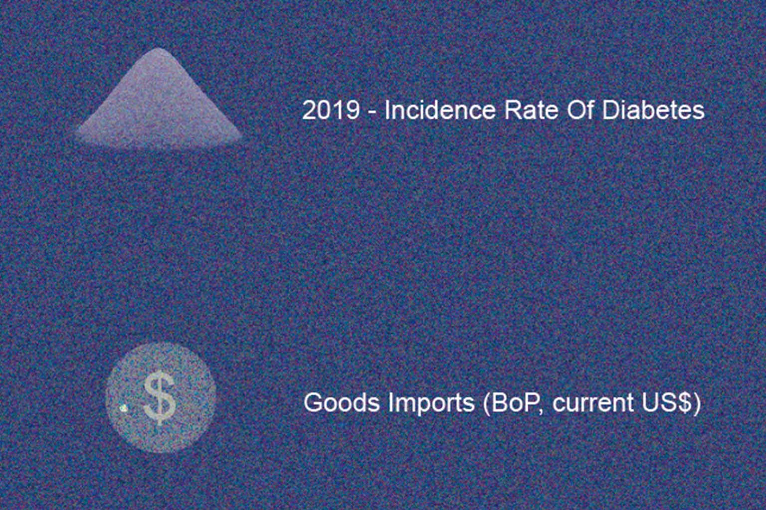
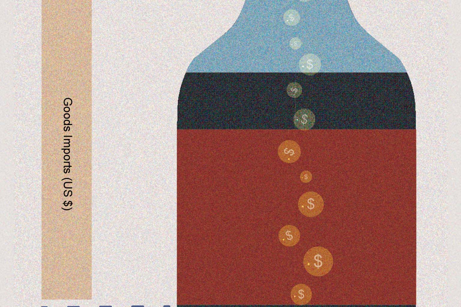
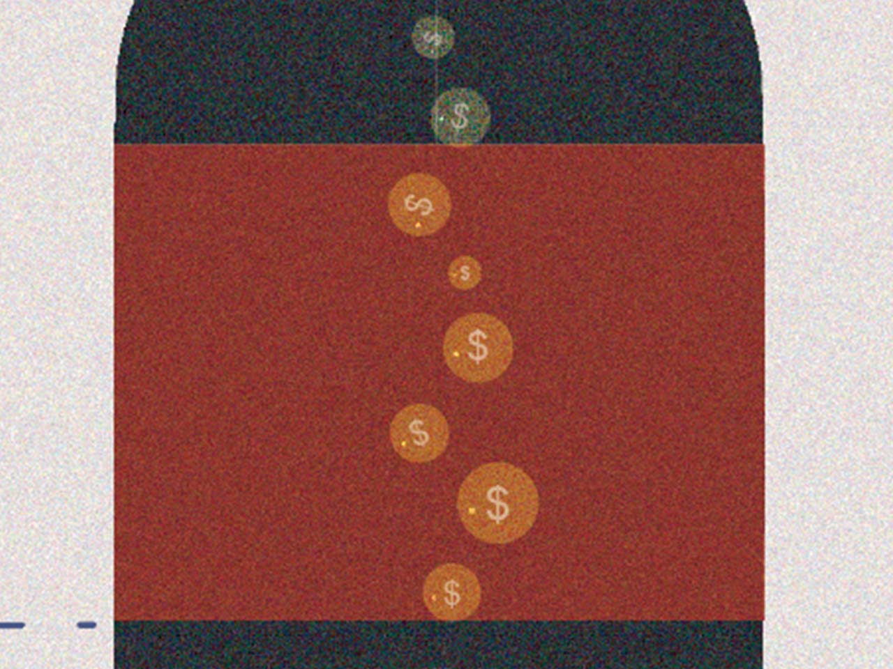
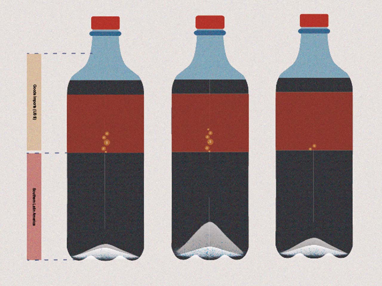
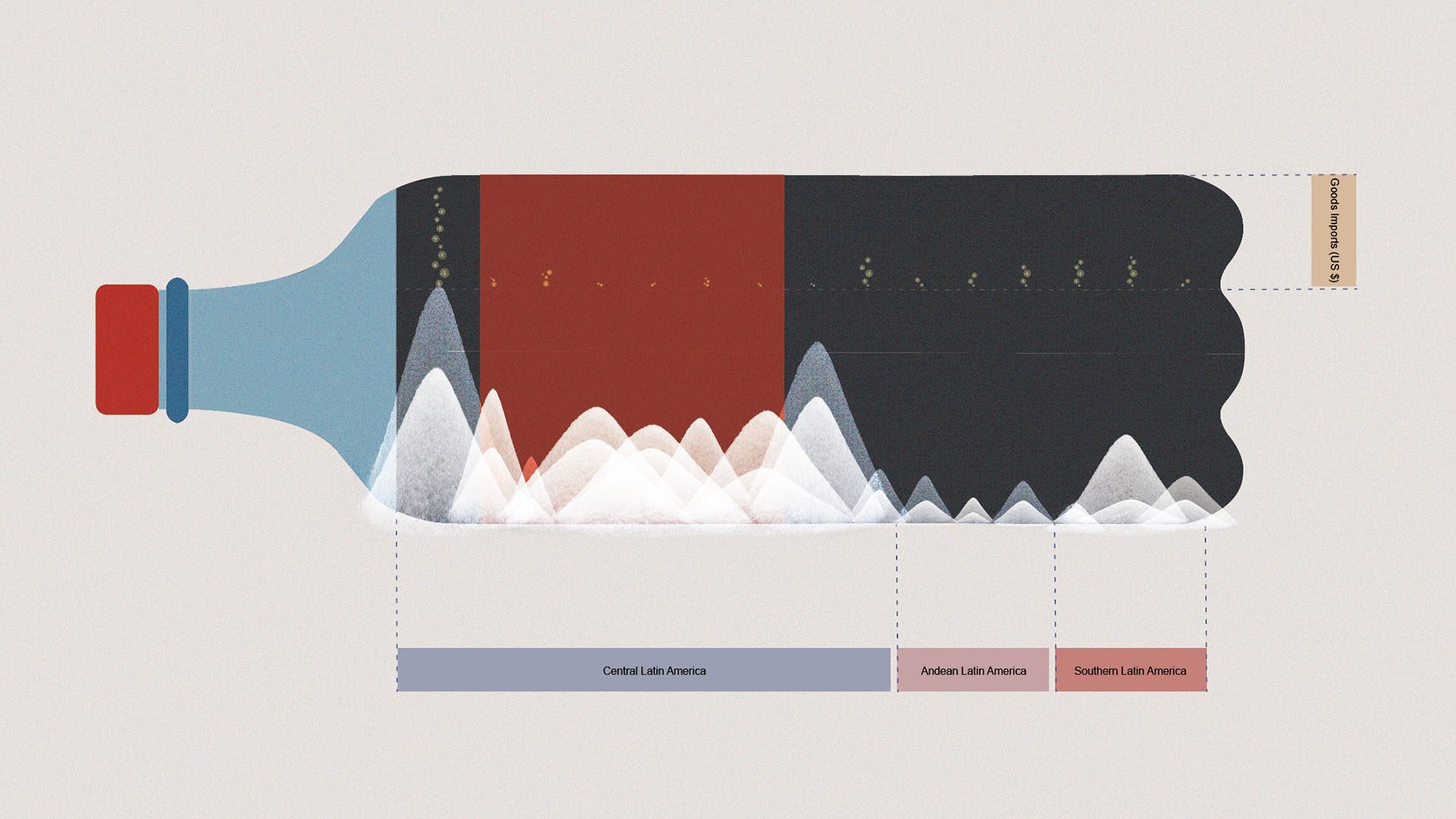
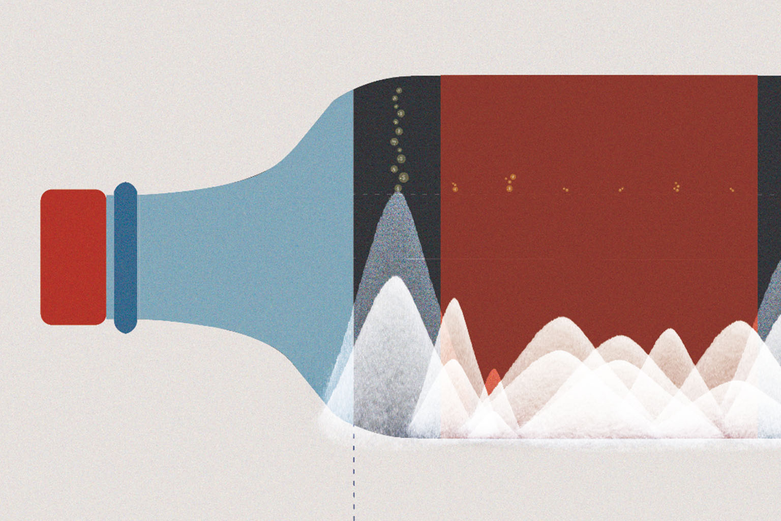
For the idea, I decided to use the shape of coca-cola as my main visual representation. It is an easy and familiar visual we see every day when we drink all kinds of sugary drinks. To represent the individual levels of the incidence rate of diabetes, there are white sugar mountains laying at the bottom of the coca-cola bottle. The height and color of each sugar mountain are different. Lighter white sugar mountain represent 2019. Darker white sugar mountain represents 2010. The yellow money air bubble will represent the goods imports. The higher the air bubbles are, the more numbers of goods imports that country have.
